Hi there to anyone who participate in this thread.
@Amigo I'm having fun with the boomerang design method, I mean Boomerang because I now trow it to you back. Be free to edit, remove any aesthetic or unaesthetic element. Ungroup is the key to get it single - some elements are duplicated in order to get more emphasis.
Thanks for your answering about tint2, I know how to change icons on the bar, but I don't know how to change the official logo on the left launcher (

). Well using tint2 I've created a button with a modified design from your last one with shadow.
The resulting file is at:
https://www.mediafire.com/file/ugw00woh ... ar.gz/file
Crucial information
LEVEL 0
0. My MX FB runs my choosen dandelion splash screen animation. It's is light blue color with MX Linux font following by the current logo.
The design is so clean-clear-solid-and robust, that in my opinion we shouldn't take it off, especially on booting time. LEVEL 0
compared to our (your-mine) modifications (especially mines
")
) that seems too casual .......
LEVEL 1
1. I'm gonna speak right now specifically about our modifications for the launcher square icon, mine design becomes to funny and informal when scales up
I believe your original models has better support on big scale i.e backgrounds . However both modifications work well for the square icon.

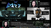
I haven't tried yet how well our friend
@Freja's design works on this LEVEL 1 Menu- Bar- dock, ( Please,
@Freja can
you show us and
example of you bar ? )
See picture for reference:

Watching this example in the LEVEL 1 with our custom designs, we can conclude

that this level could have more flexibility by the user to choose, among several mods, colors matching several themes, some others based of some palettes, perhaps with some backgrounds palettes although.
Level 2
This is free ride level but still requires some attention, this level includes the official backgrounds that still have to be well aligned to the Level 0, but transitioning with the help of level 1- Menu icon, meaning that from 0 to 2 which is desktop from factory there shouldn't be any breakage. In this example the solid level 0 that we have with the solid look as shown on dandelion splashscreen should have continuity. That's what I believe our icons can help to make the transition. Only if we take care about continuity, I'm so afraid not to have shape continuity, for example freja rounded style and our squared ones forked the style continuity. One of those styles have to be chosen by default at delivery from factory. That's crucial. Because continuity state must be also be provided to the level 0, so it depends of the chosen default design shape that will required further level 0 adaptations, not in our case with squared shapes.
Level 2.1 is when the user can choose to change some bg and launcher icons to start changing everything. In this state our new icons + bg combos can help to make first choices. Finally we get out of scene since the user wish to change everything from our end state product delivery. Holidays for us.
Level 3 is opened. Sky is the limit.
-------------------------
So lets get less theory, I'm gonna show you my designs that are not intended to satisfy at any time any change of the official logo. Still oficial logo is the best but it needs some color treatments to be multi range.
@asqwerth Honoring your presence and excellence of you personality in this forum, I have created some bg designs, one of them is kind of a desktop demo for my DevPunk V5 theme. The case is that I've used your nickname-call-sign to recreate, a metaphoric short history collage, showing my logo design and recreating some extract of one answer by
@arjaybe, but put it in your month words of the fictitious character, of course is a fiction. I've also have use this metaphor to create a critic to my self by forgetting to match the color of the Imago composition. Just I hope you liked, I'm little bit worried if you take it for something personal against you when is not.

take it as this is for Honoring your presence and excellence of you personality in this forum. I could also have used other starring from this topic

, but the content is limited in space and time.
Here we go:
Unacceptable breakage of the continuity at Level 3 triad for DevPunk V5: Fashioned but unacceptable.

Thanks for watching


