
Those are pyramids. It has to do with Memphis, Egypt, which got transmogrified into MEPIS by Warren. That they somewhat resemble an "M" is good and useful, for the MEPIS part of MX. And the "X," which I agree makes me think of a windmill, needs to continue to look like an "X" for the antiX part of MX. I hope that, however the logo changes, it remembers the "M" and the "X."AVLinux wrote: Tue Jan 24, 2023 1:11 pm First..
You have to admire the collaborative spirit of this forum and the generosity of it's patrons, I wish the outside world was more like this.. Many thanks to @Freja @Amigo @Melber
- The mountains seem a strange thing to keep when they make the logo difficult to modify (although Amigo managed to take it somewhere new)
About the MX Linux logo
Re: About the MX Linux logo
Green Comet
Space particles.
Space particles.

Re: About the MX Linux logo
That's exactly right: the mountains should stay,
I'm not worried people won't *understand* b/c for most users the logo will only denote "MX Linux," which is all we need. But connotations (elegant, refined, etc.) are important, and that is more or less what is under consideration here.
I'm not worried people won't *understand* b/c for most users the logo will only denote "MX Linux," which is all we need. But connotations (elegant, refined, etc.) are important, and that is more or less what is under consideration here.
Production: MX-23 Xfce, AMD FX-4130 Quad-Core, GeForce GT 630/PCIe/SSE2, 16 GB, SSD 120 GB, Data 1TB
Personal: Lenovo X1 Carbon with MX-23 Fluxbox
Other: Raspberry Pi 5 with MX-23 Xfce Raspberry Pi Respin
Personal: Lenovo X1 Carbon with MX-23 Fluxbox
Other: Raspberry Pi 5 with MX-23 Xfce Raspberry Pi Respin

Re: About the MX Linux logo
Hi!arjaybe wrote: Tue Jan 24, 2023 1:58 pm
Those are pyramids. It has to do with Memphis, Egypt, which got transmogrified into MEPIS by Warren. That they somewhat resemble an "M" is good and useful, for the MEPIS part of MX. And the "X," which I agree makes me think of a windmill, needs to continue to look like an "X" for the antiX part of MX. I hope that, however the logo changes, it remembers the "M" and the "X."
I had commented earlier in the thread that I was aware of the Mepis history and the significance, my question then was how relevant the symbol is in 2023... But it's important for me to be clear of course I am not suggesting a removal of 'M' or 'X' or any change beyond simply re-imagining them in another way. I sense I may be treading on some toes which is not my intent so I will leave you 'MXperts' to it! *tips hat
-
uncle mark

- Posts: 861
- Joined: Sat Nov 11, 2006 9:42 pm
Re: About the MX Linux logo
It's important and significant because it's the community that assembled itself around MEPIS that conceived, developed, and continues to provide MX. Without MEPIS (symbolized by the pyramids) there would be no MX, at least not the MX we all enjoy today.AVLinux wrote: Tue Jan 24, 2023 2:26 pm I had commented earlier in the thread that I was aware of the Mepis history and the significance, my question then was how relevant the symbol is in 2023... But it's important for me to be clear of course I am not suggesting a removal of 'M' or 'X' or any change beyond simply re-imagining them in another way. I sense I may be treading on some toes which is not my intent so I will leave you 'MXperts' to it! *tips hat
Custom build Asus/AMD/nVidia circa 2011 -- MX 19.2 KDE
Acer Aspire 5250 -- MX 21 KDE
Toshiba Satellite C55 -- MX 18.3 Xfce
Assorted Junk -- assorted Linuxes
Acer Aspire 5250 -- MX 21 KDE
Toshiba Satellite C55 -- MX 18.3 Xfce
Assorted Junk -- assorted Linuxes
-
user-green

- Posts: 326
- Joined: Sat Mar 14, 2020 1:40 am
Re: About the MX Linux logo
I agree with the concept too. In this point of view, letter "M" and "X" should be easily understood by everyone from the logo. What about to change the logo #112 by Freja like the one below?arjaybe wrote:
Those are pyramids. It has to do with Memphis, Egypt, which got transmogrified into MEPIS by Warren. That they somewhat resemble an "M" is good and useful, for the MEPIS part of MX. And the "X," which I agree makes me think of a windmill, needs to continue to look like an "X" for the antiX part of MX. I hope that, however the logo changes, it remembers the "M" and the "X."
52646304405_6299a8a146_w-fix.jpg
-
dolphin_oracle

- Developer
- Posts: 22454
- Joined: Sun Dec 16, 2007 12:17 pm
Re: About the MX Linux logo
I really like "Well-Balanced-Eclipse" . It is so jaunty and happy.Freja wrote: Tue Jan 24, 2023 9:59 am Fixed further with an asqwerth order tweak.
I honestly can't think of a better fix.
For identification Code name "Well-Balanced-Eclipse"
Transparent .png
https://www.flickr.com/photos/154078448 ... datetaken/
I solved the angle problem in the example by dividing the angle by half.
By the way, if I completely eliminate the mismatch of angles and seek
"perfect balance" in the design, it will be like this.
Too seeking perfection distorts the results.
Because of the magnificent motif of "earth and celestial sphere".
It is not possible to maintain a perfect balance,
I need a "deformation" like the first one. sorry.


http://www.youtube.com/runwiththedolphin
lenovo ThinkPad X1 Extreme Gen 4 - MX-23
FYI: mx "test" repo is not the same thing as debian testing repo.
Live system help document: https://mxlinux.org/wiki/help-antix-live-usb-system/
lenovo ThinkPad X1 Extreme Gen 4 - MX-23
FYI: mx "test" repo is not the same thing as debian testing repo.
Live system help document: https://mxlinux.org/wiki/help-antix-live-usb-system/

Re: About the MX Linux logo
When considering a design, a problem that often arises is that
multiple people have different opinions,
and it is difficult to know which direction to go.
Of course, it is also important to polish the design according to the order,
If I take all the opinions, the design will break.
In this case, right direction is required.
for this case.
We should follow MX Chief Developer/Spokesman dolphin_oracle,
he expressed a favor to Well-Balanced-Eclipse.
As a designer, I agree with his favor.
In the world filled desire,
I seek only essence, serve for MX.
I just needing only ideal in the art at all.
I want to protect place of rest called MX LINUX.
Sony VAIO Pro 11inch Silver (FHD) extrox (MX23)
I seek only essence, serve for MX.
I just needing only ideal in the art at all.
I want to protect place of rest called MX LINUX.
Sony VAIO Pro 11inch Silver (FHD) extrox (MX23)
Re: About the MX Linux logo
I agree with your decision, well done!
Production: MX-23 Xfce, AMD FX-4130 Quad-Core, GeForce GT 630/PCIe/SSE2, 16 GB, SSD 120 GB, Data 1TB
Personal: Lenovo X1 Carbon with MX-23 Fluxbox
Other: Raspberry Pi 5 with MX-23 Xfce Raspberry Pi Respin
Personal: Lenovo X1 Carbon with MX-23 Fluxbox
Other: Raspberry Pi 5 with MX-23 Xfce Raspberry Pi Respin

Re: About the MX Linux logo
Hi there to anyone who participate in this thread.
@Amigo I'm having fun with the boomerang design method, I mean Boomerang because I now trow it to you back. Be free to edit, remove any aesthetic or unaesthetic element. Ungroup is the key to get it single - some elements are duplicated in order to get more emphasis.
Thanks for your answering about tint2, I know how to change icons on the bar, but I don't know how to change the official logo on the left launcher ( ). Well using tint2 I've created a button with a modified design from your last one with shadow.
The resulting file is at:
https://www.mediafire.com/file/ugw00woh ... ar.gz/file
Crucial information
LEVEL 0
0. My MX FB runs my choosen dandelion splash screen animation. It's is light blue color with MX Linux font following by the current logo.
The design is so clean-clear-solid-and robust, that in my opinion we shouldn't take it off, especially on booting time. LEVEL 0
compared to our (your-mine) modifications (especially mines") ) that seems too casual .......
) that seems too casual .......
LEVEL 1
1. I'm gonna speak right now specifically about our modifications for the launcher square icon, mine design becomes to funny and informal when scales up
I believe your original models has better support on big scale i.e backgrounds . However both modifications work well for the square icon.
I haven't tried yet how well our friend @Freja's design works on this LEVEL 1 Menu- Bar- dock, ( Please, @Freja can
you show us and
example of you bar ? )
See picture for reference:

Watching this example in the LEVEL 1 with our custom designs, we can conclude that this level could have more flexibility by the user to choose, among several mods, colors matching several themes, some others based of some palettes, perhaps with some backgrounds palettes although.
Level 2
This is free ride level but still requires some attention, this level includes the official backgrounds that still have to be well aligned to the Level 0, but transitioning with the help of level 1- Menu icon, meaning that from 0 to 2 which is desktop from factory there shouldn't be any breakage. In this example the solid level 0 that we have with the solid look as shown on dandelion splashscreen should have continuity. That's what I believe our icons can help to make the transition. Only if we take care about continuity, I'm so afraid not to have shape continuity, for example freja rounded style and our squared ones forked the style continuity. One of those styles have to be chosen by default at delivery from factory. That's crucial. Because continuity state must be also be provided to the level 0, so it depends of the chosen default design shape that will required further level 0 adaptations, not in our case with squared shapes.
Level 2.1 is when the user can choose to change some bg and launcher icons to start changing everything. In this state our new icons + bg combos can help to make first choices. Finally we get out of scene since the user wish to change everything from our end state product delivery. Holidays for us.
Level 3 is opened. Sky is the limit.
-------------------------
So lets get less theory, I'm gonna show you my designs that are not intended to satisfy at any time any change of the official logo. Still oficial logo is the best but it needs some color treatments to be multi range.
@asqwerth Honoring your presence and excellence of you personality in this forum, I have created some bg designs, one of them is kind of a desktop demo for my DevPunk V5 theme. The case is that I've used your nickname-call-sign to recreate, a metaphoric short history collage, showing my logo design and recreating some extract of one answer by @arjaybe, but put it in your month words of the fictitious character, of course is a fiction. I've also have use this metaphor to create a critic to my self by forgetting to match the color of the Imago composition. Just I hope you liked, I'm little bit worried if you take it for something personal against you when is not. take it as this is for Honoring your presence and excellence of you personality in this forum. I could also have used other starring from this topic
  , but the content is limited in space and time.
Here we go:
Unacceptable breakage of the continuity at Level 3 triad for DevPunk V5: Fashioned but unacceptable.

Thanks for watching
@Amigo I'm having fun with the boomerang design method, I mean Boomerang because I now trow it to you back. Be free to edit, remove any aesthetic or unaesthetic element. Ungroup is the key to get it single - some elements are duplicated in order to get more emphasis.
Thanks for your answering about tint2, I know how to change icons on the bar, but I don't know how to change the official logo on the left launcher (
The resulting file is at:
https://www.mediafire.com/file/ugw00woh ... ar.gz/file
Crucial information
LEVEL 0
0. My MX FB runs my choosen dandelion splash screen animation. It's is light blue color with MX Linux font following by the current logo.
The design is so clean-clear-solid-and robust, that in my opinion we shouldn't take it off, especially on booting time. LEVEL 0
compared to our (your-mine) modifications (especially mines
LEVEL 1
1. I'm gonna speak right now specifically about our modifications for the launcher square icon, mine design becomes to funny and informal when scales up
I believe your original models has better support on big scale i.e backgrounds . However both modifications work well for the square icon.
I haven't tried yet how well our friend @Freja's design works on this LEVEL 1 Menu- Bar- dock, ( Please, @Freja can
you show us and
example of you bar ? )
See picture for reference:
Watching this example in the LEVEL 1 with our custom designs, we can conclude
Level 2
This is free ride level but still requires some attention, this level includes the official backgrounds that still have to be well aligned to the Level 0, but transitioning with the help of level 1- Menu icon, meaning that from 0 to 2 which is desktop from factory there shouldn't be any breakage. In this example the solid level 0 that we have with the solid look as shown on dandelion splashscreen should have continuity. That's what I believe our icons can help to make the transition. Only if we take care about continuity, I'm so afraid not to have shape continuity, for example freja rounded style and our squared ones forked the style continuity. One of those styles have to be chosen by default at delivery from factory. That's crucial. Because continuity state must be also be provided to the level 0, so it depends of the chosen default design shape that will required further level 0 adaptations, not in our case with squared shapes.
Level 2.1 is when the user can choose to change some bg and launcher icons to start changing everything. In this state our new icons + bg combos can help to make first choices. Finally we get out of scene since the user wish to change everything from our end state product delivery. Holidays for us.
Level 3 is opened. Sky is the limit.
-------------------------
So lets get less theory, I'm gonna show you my designs that are not intended to satisfy at any time any change of the official logo. Still oficial logo is the best but it needs some color treatments to be multi range.
@asqwerth Honoring your presence and excellence of you personality in this forum, I have created some bg designs, one of them is kind of a desktop demo for my DevPunk V5 theme. The case is that I've used your nickname-call-sign to recreate, a metaphoric short history collage, showing my logo design and recreating some extract of one answer by @arjaybe, but put it in your month words of the fictitious character, of course is a fiction. I've also have use this metaphor to create a critic to my self by forgetting to match the color of the Imago composition. Just I hope you liked, I'm little bit worried if you take it for something personal against you when is not.
, but the content is limited in space and time.Here we go:
Unacceptable breakage of the continuity at Level 3 triad for DevPunk V5: Fashioned but unacceptable.
Thanks for watching
-
Eadwine Rose

- Administrator
- Posts: 14918
- Joined: Wed Jul 12, 2006 2:10 am
Re: About the MX Linux logo
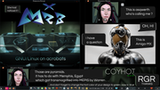
My preference is to Freja's design. Amiga-MX's, in my eyes, looks like a gamer logo.
MX-23.6_x64 July 31 2023 * 6.1.0-37amd64 ext4 Xfce 4.20.0 * 8-core AMD Ryzen 7 2700
Asus TUF B450-Plus Gaming UEFI * Asus GTX 1050 Ti Nvidia 535.247.01 * 2x16Gb DDR4 2666 Kingston HyperX Predator
Samsung 870EVO * Samsung S24D330 & P2250 * HP Envy 5030
Asus TUF B450-Plus Gaming UEFI * Asus GTX 1050 Ti Nvidia 535.247.01 * 2x16Gb DDR4 2666 Kingston HyperX Predator
Samsung 870EVO * Samsung S24D330 & P2250 * HP Envy 5030