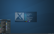
I've reinstalled MX a few weeks ago and did things slightly differently this time. Two panels, one on the left containing the menu button, disk monitor applets, notification area, and launchers for my most commonly-used apps; one on the bottom with window buttons in the middle, and the weather app, clock and Show Desktop app on the right. I decided that having everything on just one panel made it too busy and crowded. It's nothing fancy but it works for me. I tried docks instead of the bottom panel but I don't like them as well, plus a panel gives me a place to put the clock where I can use the large LED font.

(That's my customized version of the BBQ Digital Colours conky. Again, nothing fancy, but it tells me what I want to know about my system.)
Edit 05/25/2019: I won't post a new screenshot but I decided to move the bottom panel to the top of the screen for the very technical reason that my cat likes to lay between my keyboard and monitor to be petted in the evenings and I can't see through him to switch between running programs or see what time it is.